Gallery
Here some example figures from the tutorials are displayed. After you follow the tutorials, you will be able to create them.
Bubble Chart
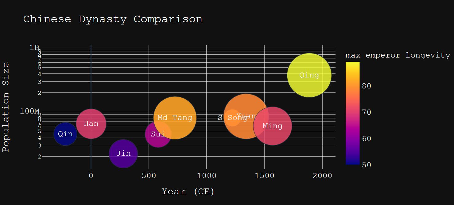
This is an interactive bubble chart plotted using Plotly together with a simple Pandas data frame. It shows the population (y-axis) and territory size (bubble size) (colored by maximum longevity of emperors) in different Chinese dynasties.
Scatter Plot
This is a simple scatter plot using Matplotlib and customized layout options. It shows how season keywords distribute in 孟浩然诗全集.

Network Chart
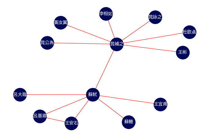
This is a simple network chart created using NetworkX library in Python. It shows the relationsip between historical figures.
Stacked Area Plot
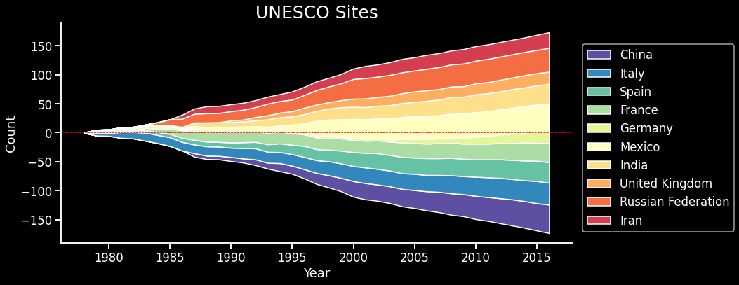
This is a variation of a stacked area plot created using seaborn. It shows development of UNESCO sites over time for the top ten countries having the most UNESCO sites.
Bubble Time Line
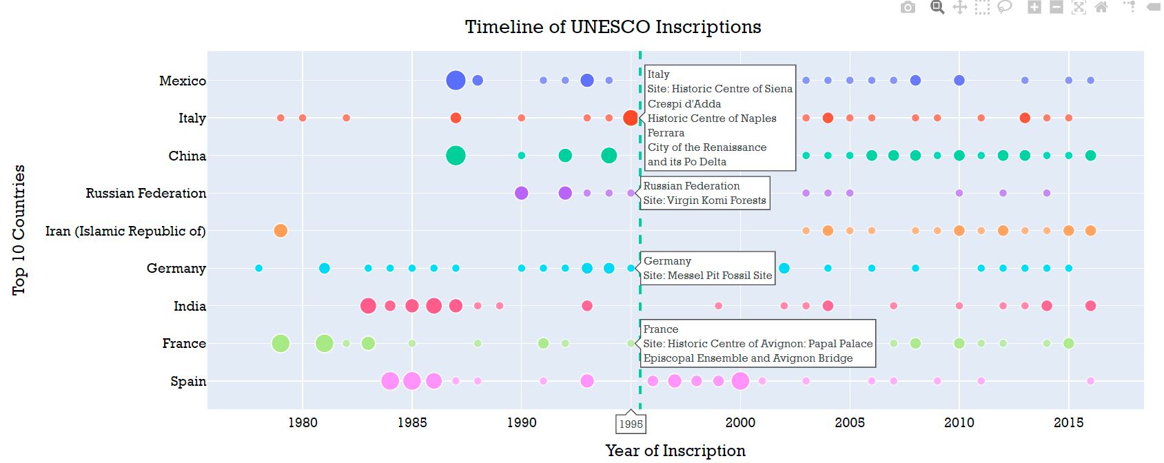
Using the same UNESCO example, this is a bubble chart showing the same temporal development. Yet, more information is embedded in the interactive hover labels using Plotly.
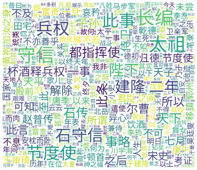
Chinese Word Cloud
This is a word cloud created using wordcloud library together with jieba for processing Chinese texts. It shows the keywords generated from《杯酒释兵权考》by 丁则良.
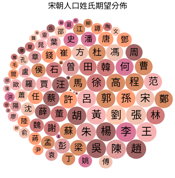
Circle Packing Chart
This is a circle packing chart displaying the distribution of family name in Song Dynasty, created using Circlify.
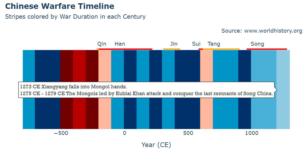
Color Stripes
These are color stripes illustrating the occurences of wars in ancient China, created using Plotly.
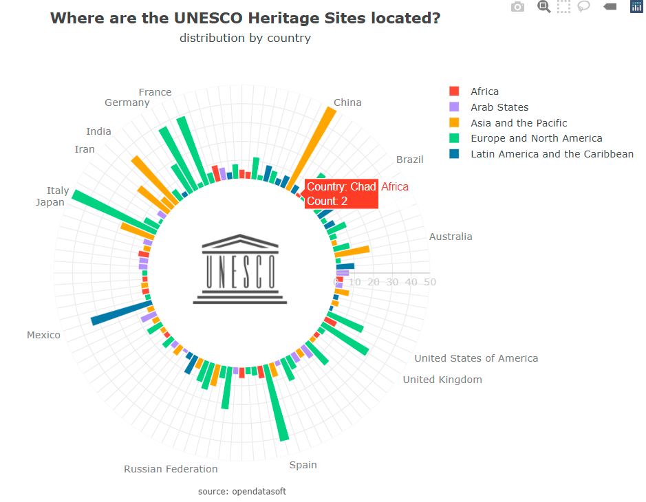
Wind Rose Chart
These is a polar bar chart created using Plotly.
(More coming soon …)
📊 Happy Coding!
